Hey Everyone,
Recently in class we watched the movie Manufactured Landscapes. This movie was created by world renown photographer Edward Burtynsky. He is from Canada and has worked with many museums such as the National Gallery of Canada or Corcoran Gallery of Art in Washington D.C., to display his work. He is a very good photographer, but also conscious of what is happening around the world. His photography and film comment on the world today as it is effected by industry. This commentary that has been left open to viewers opinions, good or bad, bring up many questions. Are the world's new landscapes beautiful? Is it a tragedy that nature is being altered in this way?
Check out this short video interview of Burtynsky discussing his work:
Personally, I find his images to be very informative as well as impactive. I felt that the movie was very interesting as you got to see what really goes on in landfills and workplaces in China (among other places). It was also very depressing. It was hard to watch at moments because it just made you think the planet is hopeless. This was a really good subject for Burtynsky to publicize. I would imagine that bringing so much attention to the issue at hand would in fact start a reaction to change.
If you can, take a look at the video or at his website, to see some of his work.
Tell me what you think,
~K
Thursday, May 26, 2011
Tuesday, May 24, 2011
Photo Shooting Experiment- With Hannah and Blair
Hey everyone,
Recently we were asked to go out and take some photos using different shutter speeds and f-stops. They did not have to turn out well as long as we learned something from the experience. My group had a some technical difficulties, but we were able to learn some interesting things.
Below are three photos that did not exactly turn out great, but we were able to learn from them.
 This first photo is over exposed. One of two things could of occurred when taking this image. The image may of been exposed too long due to whatever shutter speed was chosen. To correct this, using a faster shutter speed would allow less light to come in. Another possibility was that the F/Stop let too much light in, over exposing it. One could remedy this, by choosing a more narrow aperture.
 This photo was exposed for a good amount of time, but turned blurry. This may of happened for a few reasons. Either the photographer did not focus the image well enough before taking the photo or the depth of field may be too shallow. By not focusing or moving while the shot was being taken, the image blurred. Next time, the photographer could try standing very still and focus in on one part of the image to be captured. By playing with aperture settings, one may also change the depth of field.
 This last photo was not under or over exposed. I think this picture has a shallow depth of field as the image looks very flat. To make the depth of field longer the photographer could have adjusted the F/stop (aperture). I think it would be interesting to see this image with a longer depth of field. Another thing that could be changed in this image is the composition. The scene itself is very interesting, but the fence is in the way of the action.
Comment below if you have any suggestions.
~K
Recently we were asked to go out and take some photos using different shutter speeds and f-stops. They did not have to turn out well as long as we learned something from the experience. My group had a some technical difficulties, but we were able to learn some interesting things.
Below are three photos that did not exactly turn out great, but we were able to learn from them.
 This first photo is over exposed. One of two things could of occurred when taking this image. The image may of been exposed too long due to whatever shutter speed was chosen. To correct this, using a faster shutter speed would allow less light to come in. Another possibility was that the F/Stop let too much light in, over exposing it. One could remedy this, by choosing a more narrow aperture.
 This photo was exposed for a good amount of time, but turned blurry. This may of happened for a few reasons. Either the photographer did not focus the image well enough before taking the photo or the depth of field may be too shallow. By not focusing or moving while the shot was being taken, the image blurred. Next time, the photographer could try standing very still and focus in on one part of the image to be captured. By playing with aperture settings, one may also change the depth of field.
 This last photo was not under or over exposed. I think this picture has a shallow depth of field as the image looks very flat. To make the depth of field longer the photographer could have adjusted the F/stop (aperture). I think it would be interesting to see this image with a longer depth of field. Another thing that could be changed in this image is the composition. The scene itself is very interesting, but the fence is in the way of the action.
 Comment below if you have any suggestions.
~K
Sunday, May 15, 2011
Micro Homes
Hey Everyone,
Once again roaming Youtube, I came across something really interesting. Micro Homes. I bet many people are wondering what in the world that is, like I was. It is a home that utilizes as little space as possible. An extreme eco-home of sorts. The idea is to use only the space one needs for living in and live with what you need. It is an interesting concept as people who live in these homes have to limit what they own and be more resourceful. Take a look at the video below. This man lives in a 258 square foot apartment.
After watching that video I had two thoughts: Wow that guy is a bit insane and look at that design. I commend him for his lifestyle, one which I'm not so sure I could live, but more for his design skills. I think it is amazing that he was able to fit everything he needed into that apartment without it looking cramped or disorderly. He mentioned that he got some ideas from boats, which was very clear to me in his design efforts. I found it very interesting and made me think of how I can make my designs more functional.
Let me know what you think.
~K
Monday, May 9, 2011
Shazzam!
Hey Everyone,
Recently we were joined by Shazzam to create propaganda posters about school and the future. The major components we had to include were our own photographs, our own design and our own quote that sends a message. Below is my final poster.
 I chose to focus on the creativity within a school. Many people see the outside of a school and assume things that may or may not be true. Often, it is assumed that teenagers are troublesome and do not reach their full potential. I think this poster contrasts that notion. Breaking the mold of being a teenager and going to school will unleash a wealth of creativity. It is my personal belief that without creativity a person cannot grow or change.
Recently we were joined by Shazzam to create propaganda posters about school and the future. The major components we had to include were our own photographs, our own design and our own quote that sends a message. Below is my final poster.
 I chose to focus on the creativity within a school. Many people see the outside of a school and assume things that may or may not be true. Often, it is assumed that teenagers are troublesome and do not reach their full potential. I think this poster contrasts that notion. Breaking the mold of being a teenager and going to school will unleash a wealth of creativity. It is my personal belief that without creativity a person cannot grow or change.
 I purposely made the poster very simple and clean to create a greater impact. I really wanted to full force of the quote to be taken in and understood without too much visual competition. The image on the poster is very simple as well. It is a school breaking apart, allowing the creativity to burst free from its confines. It demonstrates how much potential lies within places people may not think to look.
I hope you liked this and feel free to comment.
~K
Friday, May 6, 2011
Imovie 11 or Final Cut
Hey Everyone,
As we are short on time, I've had to continue editing my video at home on iMovie 11 instead of Final Cut. So far I don't see much of any difference. Everything I wanted to do on Final Cut iMovie 11 has! The only catch is that it is a bit tricky to figure out. Alas, this is what youtube is for. I learned from watching several videos that: Yes! you can layer video and photos, Yes! you can edit sound with effects, and Yes! you can apply features like rotations and crops! Check out these links on layering and cutaways 1 & 2 and this article on quick tips for imovie 11.
Quickly, let me tell you about some really important tips so you are not searching forever on how to access things.
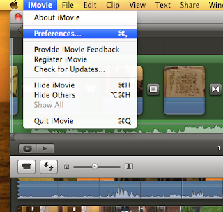
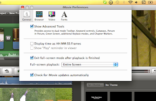
Tip#1: CHANGE YOUR SETTINGS TO ADVANCED! This will save hours of puzzling problems.

 Tip # 2 : The Precision Editor is your friend! Don't be afraid to use that. It is really good to extend transitions and adjust where it changes between the clips. Apple + / brings up the precision editor.
Hope this helps!
~K
As we are short on time, I've had to continue editing my video at home on iMovie 11 instead of Final Cut. So far I don't see much of any difference. Everything I wanted to do on Final Cut iMovie 11 has! The only catch is that it is a bit tricky to figure out. Alas, this is what youtube is for. I learned from watching several videos that: Yes! you can layer video and photos, Yes! you can edit sound with effects, and Yes! you can apply features like rotations and crops! Check out these links on layering and cutaways 1 & 2 and this article on quick tips for imovie 11.
Quickly, let me tell you about some really important tips so you are not searching forever on how to access things.
Tip#1: CHANGE YOUR SETTINGS TO ADVANCED! This will save hours of puzzling problems.

 Tip # 2 : The Precision Editor is your friend! Don't be afraid to use that. It is really good to extend transitions and adjust where it changes between the clips. Apple + / brings up the precision editor.
Hope this helps!
~K
Subscribe to:
Comments (Atom)

