Wednesday, October 15, 2008

Composition in Photography - Mood

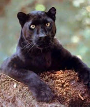
Mood is the feeling a picture invokes. A photographer can portray their mood or a mood they want the viewer to feel by photographing different elements. Specific elements evoke different feelings. For example an image of the sun and a blue sky can convey warmth and happiness. Fog might convey anxiety or mystery. One person may feel something different when seeing a picture then another depending on who they are.Losevsky Pavel


Article on Mood

By Payal and Katie

Composition in Photography - Selective Focus

Selective Focus is when you put emphasize or isolate one main part of the photo by using depth of field. One thing in the picture stands out while the background is either blurred or dull. To create selective focus you can use larger aperture to reduce the zone in front and behind of the main focal point.
(c) Veronika Vasilyuk

(c) Susan Fox


Article on Selective Focus

By Payal and Katie

Friday, October 10, 2008

"Photo District News article"

The Girl Project Lets Teens Reveal Their World

This article talks about a project that is giving girls in America aged 13-17 the chance to influence the world. Photographer Kate Engelbrecht is giving these girls one disposable Kodak camera to take pictures of the things in their world. The girls were asked to take pictures of things that meant something to them then send the camera back so their photos could be placed in a book and travelling exhibition.

Many girls are sending in pictures of their friends, nature and bits of meaningful text from posters proving that not all teen girls are the stereo-typical boy crazy type. I think this article is important because it shows that people are so much more than what they seem and it shows that young girls are not all media followers.

I like this article because it shows a truthful side to people. I can relate to this because many times I have been thought of as something that I was not because of a stereotype.

This article talks about the things I want to photograph exactly. I want to take photos of things that can influence people and that people can connect with. I want to show people real things not an illusion of what should be real.

Love Rocker_Girly

Thursday, October 9, 2008

Blog Assignment #2 - Graphic Design Link

For this assignment we were asked to post an inspirational/helpful/informative graphic design site.
I chose this one. http://www.gdc.net/

This site shows the work of other graphic designers, posts information to help you learn information about graphic design and has articles on all things graphic design. I think its pretty cool and can be useful if you have questions. I really like the GDC@50 posters part of the site. The art is amazing. http://www.gdc.net/designers/features/articles114.php

Love Rocker_Girly

Logo Assignnment


These are my two final combined (pictography and typography) logos made for a recent assignment in cyber arts class . I think these logos are good and are attractive to the eye but I think if I had more time I would have been able to create a combined logo that would represent what my company did better.

My company is called "Rocker_Girly Creations". We specialize in graphic design, different mediums of art and creative writing. The lynx represents my company because they are fast, intelligent, graceful and just over all really cool animals!

I used a lot of curving lines to create a graceful structure but also used straight lines to create strength. I used textured lines to create fur. In the colour version I used the colour green to attract attention and to also show that "Rocker_Girly Creations" is an eco-friendly place.

Monday, October 6, 2008

Inspirational Sites


One of my favourite websites to visit is www.mikasounds.com . This is the website for one of my favourite musical artists. It is amazing! Right now the site is formed as a blog but I think the graphics are really cool. The pictures stand out and are very unique. Every few days Mika posts new videos or graphic drawings. There is always something new. Since Mika draws the cartoons himself and with his sister I admire his creative talents even more.
CHECK IT OUT!

http://www.mikasounds.com/

A second inspirational site is created by my friend Payal. It is a site that focuses on blends made in photoshop and blend making contests. I think that it is an amazing site and that webmasters are very talented! TAKE A LOOK!

http://www.divineblends.co.nr/

Wednesday, October 1, 2008

Chesspiece


Our second big cyberARTS assignment was to draw a chess piece of our choice. We had to consider the composition, proportion, use of line, value and movement of our chess piece and back round. Once we were finished drawing we photographed the picture and adjusted the contrast and brightness. I chose to draw a bishop.

I placed the rook in the centre of the paper and made it large so your eye would go to it first. To draw the chess piece's proportions as accurately as possible I drew a grid box to measure out the proportions. To create movement in the back round I used thick diagonal, curved and straight lines with varied value and thickness. They lead your eye around the page and towards the chess piece. The value of the lines vary from very light to very dark to seperate lines and depth.
When I photographed the picture I had trouble with a glare along the darkest points. I used photoshop to adjust the brightness and contrast so it would look as good as it could be.