Hey Everyone,
Recently in class we watched the movie Manufactured Landscapes. This movie was created by world renown photographer Edward Burtynsky. He is from Canada and has worked with many museums such as the National Gallery of Canada or Corcoran Gallery of Art in Washington D.C., to display his work. He is a very good photographer, but also conscious of what is happening around the world. His photography and film comment on the world today as it is effected by industry. This commentary that has been left open to viewers opinions, good or bad, bring up many questions. Are the world's new landscapes beautiful? Is it a tragedy that nature is being altered in this way?
Check out this short video interview of Burtynsky discussing his work:
Personally, I find his images to be very informative as well as impactive. I felt that the movie was very interesting as you got to see what really goes on in landfills and workplaces in China (among other places). It was also very depressing. It was hard to watch at moments because it just made you think the planet is hopeless. This was a really good subject for Burtynsky to publicize. I would imagine that bringing so much attention to the issue at hand would in fact start a reaction to change.
If you can, take a look at the video or at his website, to see some of his work.
Tell me what you think,
~K
Thursday, May 26, 2011
Tuesday, May 24, 2011
Photo Shooting Experiment- With Hannah and Blair
Hey everyone,
Recently we were asked to go out and take some photos using different shutter speeds and f-stops. They did not have to turn out well as long as we learned something from the experience. My group had a some technical difficulties, but we were able to learn some interesting things.
Below are three photos that did not exactly turn out great, but we were able to learn from them.
 This first photo is over exposed. One of two things could of occurred when taking this image. The image may of been exposed too long due to whatever shutter speed was chosen. To correct this, using a faster shutter speed would allow less light to come in. Another possibility was that the F/Stop let too much light in, over exposing it. One could remedy this, by choosing a more narrow aperture.
 This photo was exposed for a good amount of time, but turned blurry. This may of happened for a few reasons. Either the photographer did not focus the image well enough before taking the photo or the depth of field may be too shallow. By not focusing or moving while the shot was being taken, the image blurred. Next time, the photographer could try standing very still and focus in on one part of the image to be captured. By playing with aperture settings, one may also change the depth of field.
 This last photo was not under or over exposed. I think this picture has a shallow depth of field as the image looks very flat. To make the depth of field longer the photographer could have adjusted the F/stop (aperture). I think it would be interesting to see this image with a longer depth of field. Another thing that could be changed in this image is the composition. The scene itself is very interesting, but the fence is in the way of the action.
Comment below if you have any suggestions.
~K
Recently we were asked to go out and take some photos using different shutter speeds and f-stops. They did not have to turn out well as long as we learned something from the experience. My group had a some technical difficulties, but we were able to learn some interesting things.
Below are three photos that did not exactly turn out great, but we were able to learn from them.
 This first photo is over exposed. One of two things could of occurred when taking this image. The image may of been exposed too long due to whatever shutter speed was chosen. To correct this, using a faster shutter speed would allow less light to come in. Another possibility was that the F/Stop let too much light in, over exposing it. One could remedy this, by choosing a more narrow aperture.
 This photo was exposed for a good amount of time, but turned blurry. This may of happened for a few reasons. Either the photographer did not focus the image well enough before taking the photo or the depth of field may be too shallow. By not focusing or moving while the shot was being taken, the image blurred. Next time, the photographer could try standing very still and focus in on one part of the image to be captured. By playing with aperture settings, one may also change the depth of field.
 This last photo was not under or over exposed. I think this picture has a shallow depth of field as the image looks very flat. To make the depth of field longer the photographer could have adjusted the F/stop (aperture). I think it would be interesting to see this image with a longer depth of field. Another thing that could be changed in this image is the composition. The scene itself is very interesting, but the fence is in the way of the action.
 Comment below if you have any suggestions.
~K
Sunday, May 15, 2011
Micro Homes
Hey Everyone,
Once again roaming Youtube, I came across something really interesting. Micro Homes. I bet many people are wondering what in the world that is, like I was. It is a home that utilizes as little space as possible. An extreme eco-home of sorts. The idea is to use only the space one needs for living in and live with what you need. It is an interesting concept as people who live in these homes have to limit what they own and be more resourceful. Take a look at the video below. This man lives in a 258 square foot apartment.
After watching that video I had two thoughts: Wow that guy is a bit insane and look at that design. I commend him for his lifestyle, one which I'm not so sure I could live, but more for his design skills. I think it is amazing that he was able to fit everything he needed into that apartment without it looking cramped or disorderly. He mentioned that he got some ideas from boats, which was very clear to me in his design efforts. I found it very interesting and made me think of how I can make my designs more functional.
Let me know what you think.
~K
Monday, May 9, 2011
Shazzam!
Hey Everyone,
Recently we were joined by Shazzam to create propaganda posters about school and the future. The major components we had to include were our own photographs, our own design and our own quote that sends a message. Below is my final poster.
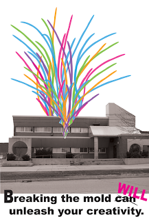 I chose to focus on the creativity within a school. Many people see the outside of a school and assume things that may or may not be true. Often, it is assumed that teenagers are troublesome and do not reach their full potential. I think this poster contrasts that notion. Breaking the mold of being a teenager and going to school will unleash a wealth of creativity. It is my personal belief that without creativity a person cannot grow or change.
 I purposely made the poster very simple and clean to create a greater impact. I really wanted to full force of the quote to be taken in and understood without too much visual competition. The image on the poster is very simple as well. It is a school breaking apart, allowing the creativity to burst free from its confines. It demonstrates how much potential lies within places people may not think to look.
I hope you liked this and feel free to comment.
~K
Friday, May 6, 2011
Imovie 11 or Final Cut
Hey Everyone,
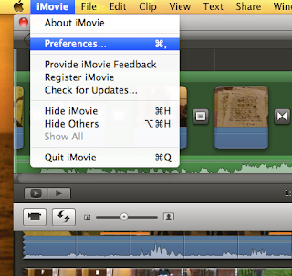
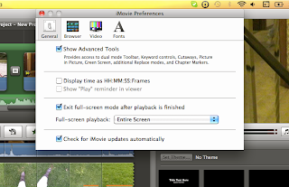
As we are short on time, I've had to continue editing my video at home on iMovie 11 instead of Final Cut. So far I don't see much of any difference. Everything I wanted to do on Final Cut iMovie 11 has! The only catch is that it is a bit tricky to figure out. Alas, this is what youtube is for. I learned from watching several videos that: Yes! you can layer video and photos, Yes! you can edit sound with effects, and Yes! you can apply features like rotations and crops! Check out these links on layering and cutaways 1 & 2 and this article on quick tips for imovie 11.
Quickly, let me tell you about some really important tips so you are not searching forever on how to access things.
Tip#1: CHANGE YOUR SETTINGS TO ADVANCED! This will save hours of puzzling problems.
 Tip # 2 : The Precision Editor is your friend! Don't be afraid to use that. It is really good to extend transitions and adjust where it changes between the clips. Apple + / brings up the precision editor.
Hope this helps!
~K
As we are short on time, I've had to continue editing my video at home on iMovie 11 instead of Final Cut. So far I don't see much of any difference. Everything I wanted to do on Final Cut iMovie 11 has! The only catch is that it is a bit tricky to figure out. Alas, this is what youtube is for. I learned from watching several videos that: Yes! you can layer video and photos, Yes! you can edit sound with effects, and Yes! you can apply features like rotations and crops! Check out these links on layering and cutaways 1 & 2 and this article on quick tips for imovie 11.
Quickly, let me tell you about some really important tips so you are not searching forever on how to access things.
Tip#1: CHANGE YOUR SETTINGS TO ADVANCED! This will save hours of puzzling problems.

 Tip # 2 : The Precision Editor is your friend! Don't be afraid to use that. It is really good to extend transitions and adjust where it changes between the clips. Apple + / brings up the precision editor.
Hope this helps!
~K
Friday, April 15, 2011
Personal Chair
Hey Everyone,
As I've mentioned a few times before, we have been working on creating our own chair designs. The two main things we had to do to create this chair were: make it exude our own personality and make it a functional piece of art. I believe I have reached these goals.
 I wanted my chair to be simple yet elegant and interesting, which I think was achieved. I wanted these qualities to be a part of my chair because I think I am a pretty simplistic person. I enjoy nature and peace which is exactly why I knew I had to make my chair some sort of flower. Not only do I like flowers, but I think it also shows my femininity. The chairs curves and simple shape help make it all of these things. Most of all, it makes it a uniquely functional piece of art.
 My chair is a very functional piece. It serves many purposes, but only the chair version was displayed in the model. Obviously the main function of this piece is a chair that has a recliner for your feet. I envisioned this piece to be made out of molded plastic, preferably recycled, to make the piece environmentally friendly. The seat would be cushioned out of upholstering materials. These two elements would make the piece more comfortable and a more usable piece of furniture. Another functional element to this chair is that the reclining part of the chair can be folding up allowed the chair to be flipped over. The opposite side could be used as a small table or stool, held up by beautiful flower petals. For me, I love to have multipurpose objects to fit my needs, so why not make my chair that way.
 The chair's smooth sides contrast with the angular points of the petals. If this model were build out of plastic and upholstery these two materials would also contrast. My piece has many curved lines that create movement and rhythm. The clean, curved lines move your eyes up and down the the piece as the form of the base gently lifts your attention to the main focal point of the chair, the seat. I think it was important for this to be the focal point as the seat is the whole reason for a chair. Without a seat, how can you sit?
I believe my chair is a functional piece of art that exudes who I am. Comment below and tell me what you think!
~K
Wednesday, April 13, 2011
Converting MP3 to AIFF for FinalCut
Hey Everyone,
Step 1: Click Preferences under iTunes.
Step 2: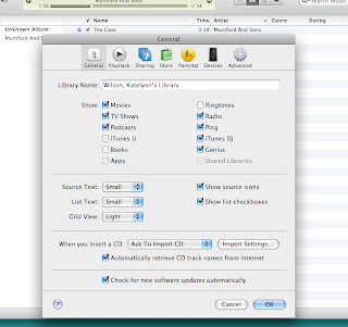
Step 3: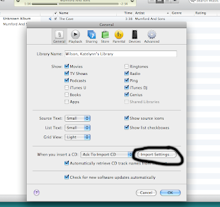
Step 4:
Step 5: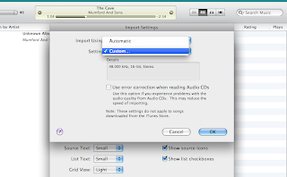
Step 6: Make the settings look like this.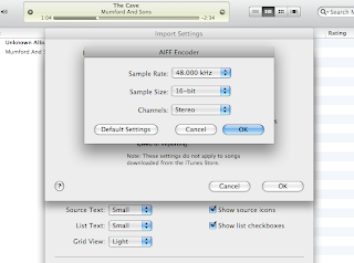
Hope this helps :)
~K
We are creating music videos in FinalCut and that means we need to import sound files into our projects. This is easy, but FinalCut is weird in the way that it likes to accept sound files. It does not like MP3 format and requires AIFF or AAC files. In the end, this is better for the video as the sound will sound better, but how do you do this? Check out this site. It clearly instructs you, step by step, on how to convert the sound file. It is actually very easy. In just two short minutes you can have sound file converted and imported into FinalCut. Take a look below at the screen shots I took if you don't understand.
Step 1: Click Preferences under iTunes.

Step 2:

Step 3:

Step 4:

Step 5:

Step 6: Make the settings look like this.

Hope this helps :)
~K
Monday, April 11, 2011
Plants and Creativity
Hey Everyone,
Spring has finally arrived and for me, that means its garden time! This Sunday I began to plant some seeds indoors and it really inspired me. It reminded me of how creativity begins. Action starts with just one idea. LIke a plant starts with a seed. That idea grows and develops like seeds turn into sprouts. From sprouts, flowers bloom as creativity and action grows from ideas. Eventually ypu'll get so many ideas you'll have a garden full! I was reminded of this while I was planting those thirty or so plants. Look at the pictures below.


Flowers and gardens are beautiful and so is art. Let your ideas flourish! Its spring time!
~K
Spring has finally arrived and for me, that means its garden time! This Sunday I began to plant some seeds indoors and it really inspired me. It reminded me of how creativity begins. Action starts with just one idea. LIke a plant starts with a seed. That idea grows and develops like seeds turn into sprouts. From sprouts, flowers bloom as creativity and action grows from ideas. Eventually ypu'll get so many ideas you'll have a garden full! I was reminded of this while I was planting those thirty or so plants. Look at the pictures below.
Flowers and gardens are beautiful and so is art. Let your ideas flourish! Its spring time!
~K
Tuesday, April 5, 2011
Frida Kahlo
Hey Everyone,
For the last sketch book assignment my class had to create, we had to make a page from Frida Kahlo's or Leonardo de Vinci's journal. I thought I was going to do de Vinci's journal, but once I researched Kahlo I was hooked. Personally, I find her art rather grotesque, but the shock of it drew me into it.

This is one of her paintings. She often painted herself in her art. She was injured very badly one day as a metal bar from a train collision pierced her breaking her pelvis and spine. I think this painting shows how she felt, broken. Her journal is full of images like this and many more disturbing. I can't seem to understand why she painted herself the way she did. Some of her paintings made her appear very ugly. Perhaps she had low self esteem. I'd be interested to know why she created what she did.
I think she based her art of self-reflection where as De Vinci's art was more technical and mathematical. She is inspiring in an odd way. I think her art is depressing yet it inspires me to be more self-reflecting. tell me what you think? I may just read her biography to learn more about her.
~K
For the last sketch book assignment my class had to create, we had to make a page from Frida Kahlo's or Leonardo de Vinci's journal. I thought I was going to do de Vinci's journal, but once I researched Kahlo I was hooked. Personally, I find her art rather grotesque, but the shock of it drew me into it.
This is one of her paintings. She often painted herself in her art. She was injured very badly one day as a metal bar from a train collision pierced her breaking her pelvis and spine. I think this painting shows how she felt, broken. Her journal is full of images like this and many more disturbing. I can't seem to understand why she painted herself the way she did. Some of her paintings made her appear very ugly. Perhaps she had low self esteem. I'd be interested to know why she created what she did.
I think she based her art of self-reflection where as De Vinci's art was more technical and mathematical. She is inspiring in an odd way. I think her art is depressing yet it inspires me to be more self-reflecting. tell me what you think? I may just read her biography to learn more about her.
~K
Monday, April 4, 2011
MysteryGuitarMan
Hey Everyone,
As I was aimlessly wandering youtube, I decided to check out MysteryGuitarMan's latest videos and came across this video. Check it out!
I chose to put this up here not only for entertainment purposes, but for inspiration. Check out his talent at editing! In the coming weeks we will be editing our own music videos and may need to get some inspiration to keep going. I say, Watch MysteryGuitarMan!
He uses so many different editing technics and tricks something is bound to spark some great idea. Check out some of his other interesting edits.
I hope this sparked some imagination!
~K
Friday, April 1, 2011
Philipe Beesley
Hey Everyone,
Recently I was talking with a friend about design and he told me to check out this designer, Phillipe Beesley. He is mainly an architect, but also designs sculptures among many other things. Here is a link to his website. I found his work very interesting. It reminded me of some of El Anatsui's work when we worked with him last year.
 This is one piece I found very interesting. It is called Hylozoic Soil and resides in the Netherlands. I found all the intricate details and movement on this piece to be really inspiring. It really is a work of art. It reminds me of an under ground cave and the beauty all the rock formations make. Beesley is really inspirational to me for creating pieces as complex as this. I also admire that he creates, not only unique pieces of art, but functional buildings. His buildings are beautiful and functional which is something I think all designers should inspire to do.

This is his plan for the University of Toronto, Southwest Campus House of Study. I find it to be a very clean and interesting layout. I really enjoyed his use of space and how each part of the campus has purpose.
I hope you found this designer to be interesting and inspirational. Comment below with any other designers I should check out or anything you'd like to say about this one.
~K
Recently I was talking with a friend about design and he told me to check out this designer, Phillipe Beesley. He is mainly an architect, but also designs sculptures among many other things. Here is a link to his website. I found his work very interesting. It reminded me of some of El Anatsui's work when we worked with him last year.
This is one piece I found very interesting. It is called Hylozoic Soil and resides in the Netherlands. I found all the intricate details and movement on this piece to be really inspiring. It really is a work of art. It reminds me of an under ground cave and the beauty all the rock formations make. Beesley is really inspirational to me for creating pieces as complex as this. I also admire that he creates, not only unique pieces of art, but functional buildings. His buildings are beautiful and functional which is something I think all designers should inspire to do.This is his plan for the University of Toronto, Southwest Campus House of Study. I find it to be a very clean and interesting layout. I really enjoyed his use of space and how each part of the campus has purpose.
I hope you found this designer to be interesting and inspirational. Comment below with any other designers I should check out or anything you'd like to say about this one.
~K
Sketch Up - Attempt #2!
Hey Everyone,
As you can see my first try at making my chair was not so successful, but after a second round of trying, (Consisting of many undo moments), I was able to produce something like my design.
 Here how I started the base this time. I created a solid triangular prisim and went from there. I think this alludes to my real design much more than my first attempt. I still cannot figure out how to make the lines into a solid face.

Here is the basic form of my chair. The idea of a flower is there, just not very detailed like a handmade model would be. I am really proud that I could figure out how to make this form as it is very, very hard to create organic lines in Sketch Up. Maybe I just need to find the trick!
Comment below if you have any tips for using this program.
~K
As you can see my first try at making my chair was not so successful, but after a second round of trying, (Consisting of many undo moments), I was able to produce something like my design.
 Here how I started the base this time. I created a solid triangular prisim and went from there. I think this alludes to my real design much more than my first attempt. I still cannot figure out how to make the lines into a solid face.
Here is the basic form of my chair. The idea of a flower is there, just not very detailed like a handmade model would be. I am really proud that I could figure out how to make this form as it is very, very hard to create organic lines in Sketch Up. Maybe I just need to find the trick!
Comment below if you have any tips for using this program.
~K
Thursday, March 31, 2011
Tips for Final Cut Express
Hey Everyone,
For our music video projects we will be using Final Cut instead of iMovie. I'm excited to use this program, but I have no clue how to! It is much different than the iMovie we use in class. I've noticed they made iMovie '11 to look more like Final Cut, but it is still a lot different for me. To learn the basics of Final Cut I found this video. I like this tutorial because it is clear, simple and concise. Take a look below.
The good thing about this video is the creator clearly outlines what each part of your screen is for and how it is used. In Final Cut, there is a canvas to make edits on which seems like a new feature iMovie did not seem to have. You can rotate clips on the canvas and create many interesting effects. The distort tool is one interesting effect that can be done. With it you can distort your clips any way you want. Apple also has some nice tricks and basic tutorials for Final Cut on their website.
Hope this helps!
~K
Wednesday, March 30, 2011
20 Minute Challenge -SketchUp First Try
Hey Everyone,
 Here is a 20 minutes attempt at creating my flower chair in sketch up. For never using the program I'm happy I was able to get the basic shape of the chair.
 Here is a 20 minutes attempt at creating my flower chair in sketch up. For never using the program I'm happy I was able to get the basic shape of the chair.
Tips For Film
Hey Everyone,
We are currently making music videos for song we like in class. For my project, I wanted to do something a bit different so it was more interesting. To do this I chose to use unique cinematography to create interesting visual effects. Part of this is choosing what type of camera angles to use and how you will compose a shot. I found this site as a refresher for myself and thought it might be helpful to any inspiring filmmakers. It outlines how you can create interesting shots and gives some examples. Some shots and angles listed on the site are: extreme long shot, close-up, bird's eye view, eye level view and many more. Check it out!
Below is a video also on camera angles and techniques. Primary it talks about action shots.
One very interesting thing in this video is 'zolly'. This is the effect of using a dolly and zooming in to create an intense moment. I found this video clear and very helpful. I hope this helps as well. Let me know if you learned anything new!
~K
Monday, March 21, 2011
Romanticism
Hey Everyone,
Recently we studied the Romantic time period of art and were asked to create a piece of art consisting of what romanticism is. I chose to do my piece of art as a collage and to make it represent the sublime in nature. My idea was to show a couple having a picnic in a valley while a storm approached from beyond the mountains. This shows the powerful and unforgiving attributes nature holds as well as the beauty it shows.
 My collage utilizes lights and darks to create a focal point and emphasize upon the lower half of the page. It was important to create this effect as it further contrasts the peaceful picnic with the approaching storm. I also used some colour contrast to help create a focal point. It was really important to me that the focus be on the couple and lower half of the page so I used colour contrast to make them stand out more. I used shades of red against the green valley grass to create contrast and made the people white in contrast to everything on the page. No no other element of the collage is white.
To create my composition, I used line to create movement that lead your eyes around in a triangular composition. Your eyes are first drawn to the bottom of the page to the point of the triangle and then you notice the storm clouds across the base of the triangle. I believe this was an effective composition because it brings you into the reality of the collage. Your eyes are first drawn to the serenity of the picnic like the people there would be, but then you notice the storm looming overhead much like the couple would eventually see.
To create more unity within the piece I used different shaped pieces of paper, roughly around the same size, to create every aspect of the scene. The different pieces of paper form cohesive shapes which makes the collage very unified. I also used values of colour to create gradation within the sky. That helped to create movement and once again bring the focus to the bottom half.
Technically, I had few problems , but I would not suggest someone with little patience to make a collage. The amount of time and repetition creating a collage takes can be really annoying, but yet somehow calming. I hope you liked this and feel free to leave a comment below!
~K
Wednesday, March 16, 2011
Beastly
Hey Everyone,
A few days ago I saw the movie Beastly. At first I was apprehensive about seeing it as it looked a bit cheesy, but it was actually pretty good. In fact, I was quite amazed at the effects they used and the imagery they chose to convey ideas with.
 I think for me, the most startling effect created in this movie was the transformation between the beast and the main character. I cannot understand how they did it. I'm torn between saying it was some mighty awesome graphics or some really sick make-up. Which ever it was, or even a mixture of, they really did a great job. He looked so different from his normal looks, it was shocking.
The second cool thing about this movie was the imagery the directors used. They used different flowers and literature to represent moods and feelings. I thought this was very nice in the film as it contrasted with the "ugliness" of the beast. The "beauty" of the flowers and literature show a different type of artistry in the movie rather then grotesque appearances. These aspects were very symbolic if the story.
Art and graphics really are in everything and are so inspirational to look at. I hope you check this movie out and get inspired to use more symbolism in your work.
~K
Wednesday, March 9, 2011
Viewfinders
Hey Everyone,
One assignment we had thus far in class was to create viewfinders and re-create the image using more vibrancy and colour. We had to create a pastel drawing, large painting and small painting, then show the best two on here. We each were allowed to chose a fragment of a larger pastel drawing as our viewfinder sample. The only criteria was that the composition had to be interesting. Here is my viewfinder below.

I chose this part of the larger pastel drawing to crop because of its interesting lines and movement. I thought it created a great diagonal composition that wasn't too boring or too crowded. I also LOVED the colours. In the pastel they were a bit dull, but I knew that if i chose this cropping the colours could be made so vibrant. The first thing we had to do with our cropping was to create a large pastel drawing of it. My drawing is below.

I believe that my pastel turned out pretty nice. From using chalk pastel before, I know that it is not my strongest medium, but I've learned a lot about how to use pastel effectively from this assignment. I learned how to enhance colours and create value with blending from doing this. I think I achieved this in green and blue swirls the most. I was effectively able to create a large scale copy of my cropping and boost the colours. Although I used chalk pastel, the colours look more vibrant than most pastels do. The two hardest things about using the pastel were making sure the pastels were not rough enough to cut the paper and keeping the paper from getting dirty. I noticed that even when I was doing gentle strokes the pastels made scratch lines on my paper. I did not understand this as I was not pressing hard at all. I examined my pastel piece and from that there were some sharp edged on the pastel creating these lines. From then on I rubbed the piece of pastel I was using on some scrap paper to remove this hazard. As for getting the paper dirty, pastel makes your hands soooo messy. It was difficult not to get darker coloured spots where you did not want them. Overall I liked my pastel and thought I did a good job.
The next part of the assignment was to create a large painting and then a small painting of our cropping. I personally did not enjoy the large painting and thought it turned out a bit messy. Therefore, my small painting is the second work I will be showing you all.
 I really liked to paint the small version of my cropping. I really loved how much detail you could pour into it. I used three different sized brushes and acrylic paint to create it. The tricky part of this painting was getting the brush strokes just right. I tried to create a lot of texture and purposeful lines. I found that a bit difficult due to the curved lines and blended colours. I think I achieved what I wanted in the end. The colours came out perfectly and I think I achieved my goal of having layered colour as well. In the bottom half, the layered colours were used to create texture as well. I really enjoyed this painting and hope you all enjoy it as well!
~ K
Saturday, March 5, 2011
Kaki King
Hey Everyone,
Today I wanted to share a really talented musician with you. Her name is Kaki King and is a guitarist. She is really talented and plays in a very unusual style. By genre, I suppose she would be called a classical guitarist, but I think she should have her own genre. I first heard about King when I played classical guitar and needed some motivation. It totally worked.
Check out her website and find out a little more about her if your interested. From her music I've been able to come up with many ideas when I've been in a funk. Her music has so many different levels and sounds it just makes your mind wander. Maybe it can help you out too. Below is one of my favourite songs played by her. Pink Noise.
Thursday, March 3, 2011
Video On Trail - Blogger Edition!
Hey Everyone! Welcome to a special blog posting : Video On Trial!
I'm going to talk about two videos and judge them from an artist point of view. (Aka are they awesome or just not good.)
First up....
California Gurls -Katy Perry
Let me start off by saying that I actually do like this song. However, the video is completely insane and I mean insane in a bad way. First, there is no connection between all the candy other then a sexual one. There seems to be no point to this video other than sexual innuendos. As a viewer I want to see a video that goes along with the song or at least something that makes sense. The only thing good about the video to me was the animation effects and the vibrant colours.
Next up...
Thriller - Micheal Jackson
I chose this as a good video for a few reasons. Although made in a different time, for the time the effects were cutting edge and made people terrified due to the werewolf's face. The story makes sense for the song and the song in its own is just awesome. You can't break this classic. Then just to make this video even better, good old MJ breaks out into the famous Thriller dance. There is a reason why this song is so famous and why everyone knows this dance. The video was good and the story was effective.
Let me know what you think! Leave a comment and join this Video On Trial.
~K
Tuesday, March 1, 2011
I Am Number Four- From Book to Movie
Hey Everyone!
Hands up those who have seen I Am Number Four! I just recently saw this movie and it was amazing. So amazing that I even bought the book the next day. Check out the movie trailer below.
I wanted to post about this movie because it really motivated me. The story line is great and really captivating. Every second you want to know more, which is the best thing you can have happen while your watching something. After watching the movie, I had an influx of great ideas for my upcoming music video project. It was truly inspirational. On another level, all the effects used and interesting camera angles really kept you interested in the production of the movie. Explosions and morphing animals were just two really interesting effects in the movie. Obviously I do not have the technology for this within my reach, but it again gave me some cool thoughts on how to make my music video interesting. I could make morphing effects with the animation programs I have access to. I am going to remember this movie when trying to create my video.
I hope you enjoyed this post and check out that movie! Its awesome!
~K
Monday, February 28, 2011
Movie Trailers
Hey everyone,
And here is my version:
I tried to play up the connection between some of the characters as well as change the mood to a more light hearted action film. The original trailer gives off thriller type mood so going for a more light mood drastically changed it. I had a bit of trouble finding a song to go along with mood I wanted to portray, but in the end I think it worked out nicely. I used one of Beethoven's musical pieces to match my trailer as well as keep it legal. It is illegal to use current artist's songs without their consent. Although this is only a school project, I wanted to honor that industry rule. All the sound effects I used were also royalty free or made through foley. I hope you enjoy it and feel free to give any constructive criticism!
~K
I completed my movie trailer assignment so here is the original:
And here is my version:
I tried to play up the connection between some of the characters as well as change the mood to a more light hearted action film. The original trailer gives off thriller type mood so going for a more light mood drastically changed it. I had a bit of trouble finding a song to go along with mood I wanted to portray, but in the end I think it worked out nicely. I used one of Beethoven's musical pieces to match my trailer as well as keep it legal. It is illegal to use current artist's songs without their consent. Although this is only a school project, I wanted to honor that industry rule. All the sound effects I used were also royalty free or made through foley. I hope you enjoy it and feel free to give any constructive criticism!
~K
Sunday, February 20, 2011
iMovie'11 Tips
Hey Everyone,
Recently, I updated my personal Mac to iLife'11. This means I now have iMovie'11 to work with! Sadly, this is a bit of a problem even though the software is waaaayyy better. It is so different from the old iMovie I had ('08). After googling and searching, I've found some things to help me navigate and learn the new features. This site was very helpful in pointing out that I can change the layout of the program to be more like the old one and some of the drag movements I can use on the trackpad.

I also found this site, which gives some tips about editing the audio in your movie. This was very useful to me as the sound editing is also much different in this iMovie compared to the last. One of the most interesting things I learned was that iMovie '11 has new audio effects. Some example effects you can choose from are: robot, telephone or cathedral. There are many more, but these three jumped out at me. Hopefully one of these sites can help you in one of your future projects. I know they will help me!
K.
Recently, I updated my personal Mac to iLife'11. This means I now have iMovie'11 to work with! Sadly, this is a bit of a problem even though the software is waaaayyy better. It is so different from the old iMovie I had ('08). After googling and searching, I've found some things to help me navigate and learn the new features. This site was very helpful in pointing out that I can change the layout of the program to be more like the old one and some of the drag movements I can use on the trackpad.
I also found this site, which gives some tips about editing the audio in your movie. This was very useful to me as the sound editing is also much different in this iMovie compared to the last. One of the most interesting things I learned was that iMovie '11 has new audio effects. Some example effects you can choose from are: robot, telephone or cathedral. There are many more, but these three jumped out at me. Hopefully one of these sites can help you in one of your future projects. I know they will help me!
K.
Thursday, February 17, 2011
The McGurk Effect
Hey Everyone,
As we are currently creating our own audio tracks for our re-created movie trailers, I thought of this interesting video I saw once. This video is about The McGurk Effect which is about our senses of sight and sound. In a nutshell, this effect is makes you aware of your brain's sight perception. When you hear someone making a sound, you recognize not only the sound, but how the sound is made. This includes small things that you don't even realize you are picking up. For example, how the lips are moving. The cool thing about knowing this is when you apply the McGurk Effect. Lets say the person you are watching is making the same sound, but moving their lips in a way that you know creates a different sound, suddenly you don't hear the actual sound but rather the one that those lip movements should be making! This video demonstrates this phenomenal occurence. Also, no matter how much you know about this effect, you can't over ride your sight perception! This can really show the power of sight and sound in art. One little change can create a whole illusion. Check it out :)
As we are currently creating our own audio tracks for our re-created movie trailers, I thought of this interesting video I saw once. This video is about The McGurk Effect which is about our senses of sight and sound. In a nutshell, this effect is makes you aware of your brain's sight perception. When you hear someone making a sound, you recognize not only the sound, but how the sound is made. This includes small things that you don't even realize you are picking up. For example, how the lips are moving. The cool thing about knowing this is when you apply the McGurk Effect. Lets say the person you are watching is making the same sound, but moving their lips in a way that you know creates a different sound, suddenly you don't hear the actual sound but rather the one that those lip movements should be making! This video demonstrates this phenomenal occurence. Also, no matter how much you know about this effect, you can't over ride your sight perception! This can really show the power of sight and sound in art. One little change can create a whole illusion. Check it out :)
Friday, February 4, 2011
A New Year.
Hey Everybody,
Its a new year and a new semester. I'm back in cyberARTS to learn more about art. Hopefully with all the knowledge I've gained and will gain through cyberARTS, I can pursue Interior Design or Architecture. I want to learn more about designing this year and how to take ideas into reality.

Whats New With Me?
Some things I like now and still enjoy are: speaking different languages, writing, reading and traveling. I've also found that I really enjoy fashion and creating outfits for people. I'm not too great at sports, but I do like to play badminton and soccer. In the future I'd like to attend school in a different province and create my own business.
What I Want to Achieve This Year?
I want to learn more about how to make things to please clients and how to use photoshop better. Photoshop is something I have difficulty with sometimes. I think my strengths are video editing, web editing and illustrator. In art, painting is my strength.
~Katelynn
Subscribe to:
Posts (Atom)