Monday, June 14, 2010

Technicalogical Fashion

Hey Everyone,
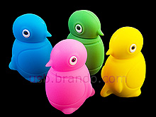
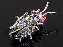
A few days ago I went to the movie theatre and saw the most ridiculously cool thing ever. USB keys that look like jewelry. I couldn't believe my eyes. Who ever finally thought of this was really smart. Imagine how many people will use these. Personally I would love one, maybe not a bug necklace but I would love a stylish key.


You can check this one out HERE. These little guys pack a lot in them too. This one in particular holds 8GB.

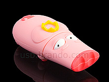
Here are some more fashionable USB keys that you can't wear but sure do look cool.


I think that technology is venturing into a more personal realm, whether this is good or bad, I am not really sure. Just look at that cute little piggy! Awww!

Katelynn

Monday, June 7, 2010

Let the Drummer Kick

Hey Everyone,
A little while ago we did a unit of kinetic typography. Recently, I came across this video that perfectly show cases a simple yet effect kinetic typography animation.


I found this video to be inspirational in some very cool ways. I love how every word has meaning in such a simple way. You can feel every beat in each word. It is a real wonder to watch the words and sounds come together to create such a strong bond. Often times artists try and add words to enhance a piece but end up wrecking it. I think that this animation shows the power of words and the unity there can be between words and sound. I admire this feat as it inspires me to use simplicity to convey strong meaning. I wish more artists would keep things simple and not add extra hoopla just to add things where there isn't a need. I wish things would just stay simple and have unity.

Katelynn

Sunday, June 6, 2010

Ian Ruther

Hey Everyone,

I love looking at pictures in any shape or form. I love when people take things that they see as beautiful or controversial and take pictures to show their feelings. This is one photographer that caught my eye. I learned about him through reading another blog and eventually ventured to his blog to see what he was all about. His photos are amazing as well as his character.


This video talks about his project called "Enabled". It is a project for those with disabilities. Through this some truly inspirational stories came out and he photographed all the athletes. I really like his work and hope that if I ever have the audience to make big changes through art, that I will do so. He is Enabling all those who see his work to be better people whether they are able bodied or not. Nicely enough he is pretty talented as a photographer as well. Check out his Website here to look at more of his work.

Twist and Pulse

Hey Everyone,
I saw these guys dance and it just brought me inspiration. I love how they dance. Take a look.
Audition


Here is there Semi-Final Routine!

Watching them amazes and entertains me. They are really funny yet really talented at dancing. Their energy influences a whole bunch of things. It makes me want to paint in a street style but in my own way. Taking street art and putting it to a canvas. The songs they dance to paint something of vibrancy and brilliant colours. I'm not sure what I imagine while hearing and seeing their routine but maybe some of you see and hear it too. Leave a comment if you do.

Katelynn

Thursday, June 3, 2010

Kandee Johnson

Hey Everyone,

Last year I stumbled across this amazing person while scanning through youtube videos in my boredom. I cannot believe what a strong, kind and talented person Kandee Johnson is.

She is a professional make-up artist that has worked on movie sets with celebrities as well as normal day folk such as brides or her friends. What makes her such an inspiration is her story and how she got to be where she is today. I'll try and briefly explain but go check out her blog and videos if you want a more rounded story.
At a young age she got married to a guy who was not the best for her. She had a son and struggled living with this guy who did not treat her well. She felt like her dreams were dying but managed to get away. Then she ended up marrying another guy who was also not the best choice. She had another son and a daughter at a very young age. Again she felt her dreams falling apart but she finally managed to break away and start her career. She had gone to beauty school and knew she wanted to do make-up so she fought to follow her dream.

That is a small summery that may not be as clear as she could tell it but to me she is an inspiration. She came out of probably one of the darkest times in her life and realized her dream. She supports herself and her kids while having plenty of ideas to make other peoples lives better. She makes her own videos and edits them herself, she makes jewelry and she paints. She may not be a cyber artist but I think she is an inspiration to all artists. She shows that we might not make it on the first try but if you keep trying you will make a break through. Personally I want to be an artist like her. One that is kind, full of creativity and uses her talents to make herself and others happy.

Katelynn

Thursday, May 6, 2010

Effective Web Design

Hi everyone!

Recently we began to learn about what makes websites effective and make people want to come back to it. We will be creating our own web pages soon and we asked to research some effective and ineffective web designs.

The first website I looked at was "MuggleNet".


MuggleNet is a website for Harry Potter fans. I think that it is very easy to catch on to this but I do not think the design of the site is very effective. There are tons of things going on through out the page. This site is not simple enough visually. There is so much text, all squished into one section. There is not a lot of 'white space' between each part causing no breathing room. Users may feel over whelmed trying to find specific information. The navigation key is very easy to find on the left side of the screen but there are so many options it becomes over whelming to find what you are searching for. Users don't want to have to be confused over where they are going through out the site. If they have to spend a long time searching for what they want or sifting through articles they may loose interest and leave.
Look how many navigation options there are. There are so many and within each one there are more search options. This is good for information but this many options could be annoying to search through.


The two good elements of this website that I think draw some users back are the amounts of information that Harry Potter fans may want and the fact that this site has functions that are able to be customized and intractable. Users like to be in control and by being able to do so makes them feel like they are able to control what they do and where they go on the site. On this site polls make the site more personable and interactive and custom backgrounds help personal the site to suit the needs of the user.

The second website I looked at was "Apple".


This site is designed so well. It so simple that it doesn't require much thought to use. You instantly see the navigation at the top, you can tell this Apple as their logo is the first box in the top navigation and you see their most recent product right in the middle of the page. This is a very effective use of making it usable without much thought and efficient use of words and symbols to grasp a user. In fact the few words and symbols on this page are even informative. The apple logo tells you this is Apple and the phrase "Ipad is here" tells users that their latest technology, the ipad, is available and can be purchased here. All this simple elements make users want to come back. There time was not wasted as they probably found it very easy to find what they wanted. Simple layout and use of white space lets the user breathe and not feel overwhelmed. Simplicity is key.

Katelynn

Monday, May 3, 2010

Self-Portrait

Here is my finished self-portrait. I won't bore you with details but I'll let you interpret this the way you wish. Some quick details about this piece are: its meant to re-create the surrealism art style and it was made in adobe illustrator. Click on the image to see it in a higher detail!
Katelynn

Thursday, April 29, 2010

Controversy.

Hey everyone,

I'm not sure how many of you are apart of another culture or speak a different language but I am lucky enough to be friends with people of several different cultural backgrounds. Many of my friends are Indian and take me to watch Bollywood films at the local theatre. One day a few of us went to see the movie 'Rab Ne Bana di Jodi'. It was about a couple who are arranged and live together, married, while the man loves his wife but she does not harbor the same feelings back. The woman sees a flyer for dance classes and asks if she may go. Her husband says yes to make her happy but then comes up with the idea to dress up as a different person so he can be close to her. I won't spoil the ending but this is one song from the movie that caused a lot of controversy. It is about how he sees God in her and how much he loves her. He doesn't need her love back because God blessed him by making her his wife.


Without knowing what they are saying you can see that the pair goes to many different places to pray but they go to different sites for different religions. When I was watching this I was so confused not being able to speak Hindi. Many people are shocked at this scene also. Some say that it is outrageous that the director made people of most likely Hindu faith mime other religions and faiths where other people are happy that their faith was shown in a Bollywood film. This video's comments are full of controversy and opinions.
As an artist, I want to be able to stir opinions and thought in people. This song is beautiful as well as the shots and props used in it. Every scene is so bright and cheery conveying his heart's feelings. The dancing works with the rest. This video is art. I think often times we forget that art doesn't have to be spoken in a language we understand or one at all for a message to come across strong and clear. I think this scene is meant to show the feelings of this man towards his wife but also the feelings of the creators behind it. I think this video sends the message that everyone in the world is different but compassion lies within us all.

Katelynn

Thursday, April 22, 2010

Creativity Still Lives

Hey Everyone,

Lets just say I was in shock watching this. It amazed me and made me do something I have not done in a very long time. I watched a music video.


Wow. That was the word I kept thinking while watching this. Well, that and what the heck is going on? I'm not sure where to start. It is so beautiful yet extremely weird. I love how as the camera rotates, the room is set as a colour wheel. I've never seen something like this. Why did they choose to do that? Do the colours stand for something? I'm not really sure but it keeps me interested. Another weird thing is that only one whole person is in the entire of the video. What I mean by that is that they only show parts of people. Their heads, their torsos. their hands but never the whole body. I think that it shows how music is made up of many parts. The video shows it because if you hear a drum there is a part of a person playing the drum. It is simplistic yet so complicated. I also love how the video brings a sort of old world charm. It doesn't quite feel old but it is not quite modern. Some aspects of historical home decor are present. The details on the fire place are very ornate and organic yet the colours some how speak 2010 to me.

I hope you enjoyed this video from an artistic perspective if not a musical one. The next time I make a video I hope I can make people think and wonder as this video made me. The artistic detail is truly amazing and was nominated for a Juno award.

Wednesday, April 21, 2010

Sprockets Film Festival

Hey Everyone,
On Tuesday April 20th my class attended the 2010 Sprockets Film Festival. We spent the day at a movie theatre watching an assortment of small shorts and one full length film. The age range was vast throughout the event and many had the opportunity to talk to those who had a role in creating the films. Directors, writers and artists were all available for a Q and A session.

As for my favourite film, I liked one of the short films best. It was called 'Iran: A Nation of Bloggers'. This was may favourite for a few simple reasons with the first and most important being that it made me think. The film was just a short animation about new technologies, in specific blogging, that allow opinions to be formed and presented to the world in a place that you could die for having an alternative opinion. According to this film Iran has the 3rd largest collection of bloggers. Can't they die if caught? Why risk your life to state an opinion? What sort of opinion is so important? How will figures in power handle this? How are figures in power handling this? ... These were some thoughts that were brought up in my mind as I watched. The animation seemed to fit the mood. Fast flashing images formed an intense visual to go with the facts being told. I found them very effective as well as the colours and artist choices made.

If you look at this still frame taken from the film you can see many things. The lighting is dim and the colours dark perhaps showing the darkened times Iran is facing. The thing though that I love so much artistically in this still in particular is the wall paper. It is damask wall paper which was used in powerful, rich , well respected homes in the past. It was a traditional wallpaper and still is today. I think this could contrast against the blogging as writing a blog is not traditional or considered 'proper' there. Are these blogger's opinions breaking the traditions found in Iran? The computer screen does split the wallpaper in half and cover most of it up. What do you think?


As I mentioned earlier we watch a full length film as well. It was call 'U' (pronounced "ooo" like ooo la la) and made in France. It was interesting to watch as it was in french and so different from any animation I've seen in North America. Even the drawings were weird to me (Picture of U on the left and Lazare on the right). The story was about a dog princess that is lonely and lives with two rats who are her guardians. She then meets U a unicorn who makes her very happy until Lazare (a lizard) and his family come to live in a nearby tree. The princess falls in love with Lazare's brother which causes U to shrink because she no longer in need. I found the story a little too jumpy in the film and way over sexualized for a children's film. It seemed like every few minutes a hidden sexual comment was being told and almost every character was naked in the film. These two things sort of bothered me as I am not sure I would want young kids watching it. Maybe in France this is normal to watch but living in North America it is not so obvious in children's films. With that beings said, Disney animations do have sexual jokes hidden in some of their films but I find them to be much more discrete and the characters are not obviously naked. I also enjoy the style of cartoon drawing Disney films rather than the style of 'U'. This may be a bit biased as I grew up on North American films rather than European ones. It was a good experience to see different perspectives on animation and film though. It was a good learning experience.

Katelynn

Friday, April 16, 2010

Mystery Guitar Man

Hey Everyone!

Once again wandering through Youtube videos, I came across something great. The Mystery Guitar Man. Below is his latest video.


I cannot begin to think of where his ideas come from. It is so interesting to see what new musical sounds he can create. On his Youtube channel he has posted videos of him making music out of the oddest things in the weirdest places. He created a samba tune out of phone books and another cool tune at an airport by using the sounds in the terminal. How did he think those up? I like that he actually has music talent and that he is interested in computer animation. In another video he animates a fake laptop made out of Styrofoam. It appears to work like a real laptop but a in weird imaginary up way. How cool is that? He seems to play every instrument you could think up including the guitar, drums, rubber band and cereal bowl. Now that is knowing how to play music. I also admire that he likes to include those who watch the videos as if they were right there with him. He has created videos that you can react with and asks for viewers to leave comments about different opinions he brings up.
Below is my favourite video that he has made.


The song, although made by someone else, is just made to be put with a video like this. I was truly inspired by this. It is a technological flip book. Old animation traditions are being brought into the year 2010!
He is a great artist and I hope that he one day is able to inspire the world like he has me.
Here is a link to his store. Check it out! Don't forget to comment, leaving your thoughts :)

Katelynn

Thursday, April 15, 2010

Advertising In Strange Ways.

Hey Everyone,

Perhaps many of you have noticed that ads are everywhere. The bus, the mall, on T.V.... Everywhere! I was exploring youtube one day and came across some great ads and some not so great ads for different products such as phones, laptops and video game systems.


This is an odd ad that is strangely appealing. I'm not totally sure why they launched a chair into space when their product features a laptop but perhaps that is the beauty of it. Its a mystery that pulls the viewer into wanting to know more. Maybe the chair symbolizes comfort and by launching it into space the makers of Toshiba are saying that you can use their products in comfort wherever you are in the world. Maybe they want you to interpret their products to whatever you need. I thought the ad was interesting but did not make me want to buy one of their laptops.Artistically, the red colour of the chair really draws your attention and makes you wonder further. The colour red could mean many different things just like this video could. I liked the camera angles because they gave the video a edgy look that you don't typically see in most ads. Here is a video of the launch.


This ad is for xbox 360. I am not a fan of the system but whoever thought up and carried out this commercial was a genius. I think it is one of my most favourite ads ever. Every shot taken on the screen has purpose. At the begining, the quick facial shots build suspense. You don't know what is going to happen or why they are holding up finger guns. Then BAM, literally, a full blown gunfight takes place in a mall. I find this sooooo funny. The music and human sound effects bring the piece all together. The motions are choreographed in such a realistic yet imaginary way that it just fits. The concept for me was that all the people in the mall begin playing an xbox game in the mall by using pretend guns. This is sort of like a video game. It is pretend. Then one "gunman" shoots a man on the phone. This is my absolute, favourite part. The man finishes his phone conversation then once he hangs up, fake dies. This is showing that when you play video games, real life comes first! GENIUS! I love the comedy of the video and hope you do too.

Katelynn

Sunday, April 11, 2010

Tim Burton

Hey everyone,
I wanted to share with everyone my favourite creative mind, Tim Burton.

The reason I say creative mind instead of something else is that he does soooo much. He draws, makes clay animation, directs... He is a true artist. I am a big fan of his. I enjoy that all his work is so conceptual and looks beautiful. Check out his website (2010)! When I opened it I could instantly tell that it was his website. All his work leaves a unique impression. You can tell when something was created by Tim Burton. Some of his works include Coraline, Edward Scissor Hands, Sleep Hallow,The Nightmare Before Christmas and Corpse Bride.

Corpse Bride
Edward Scissor Hands

All his works seem to feature dark, mysterious characters but in my opinion usually aren't as dark as they seem. I find that most of his works show positivity hidden in darkness. From watching documentaries and interviews featuring him, I learned that he used to work as a storyboard artist at Disney! I could not believe it. His style is far too enchanting to be locked up in with singing animals and happy little dwarfs. Some other interesting facts about him are that he works with Johnny Depp in many of his films, he is dating Helena Bonham Carter, has two children and his character Jack Skellington from The Nightmare Before Christmas appears in several of his films in the background or as part of objects.

I don't think I'll ever get enough of seeing his artwork or films. They are all so creative and entertaining. They offer Humor, Romance, Mystery,Action... Everything I could want to see in a film.
I'm not sure if i could pick a favourite film of his but I can say that I can watch Coraline, Beetlejuice and The Nightmare Before Christmas over and over again. Comment below if you are a fan of Tim Burton too. If you aren't.. Comment and tell me why! :)

Katelynn

Friday, April 9, 2010

Tips and Tricks: Creating Chinese Bamboo

Hey Everyone,
On the post below I linked THIS website for you all to take a look at. Well as I was finishing that post, I began to look at the other tutorials and found THIS. It is a tutorial on how to make Chinese Bamboo chutes in Adobe Illustrator! This caught my eye because we created bamboo chutes using Chinese water colour ink in art class. The guide lays out simple yet detailed steps on how to create such an image graphically but I do find the guide a bit long. They show steps ordered 1 through 15 to teach you how to duplicate their interpretation.
They start off by creating outlines of the bamboo shape with the pen took using a green coloured fill. Then use the mesh tool to create a 3D effect on the image. The steps continue to walk you through creating a bamboo image but what I found most interesting was how they used the symbol tools. To save time, the artist created a sort of spray paint version of a bamboo leaf to create more leaves on the image without drawing them all out or copy and pasting. It is so simple it is genius! I really liked this tutorial and found it very easy to understand.

Katelynn

Tips and Tricks For Tracing A Photo In Illustrator

Hey everyone,
I wanted to share a great new project I have started working on for a class assignment. We are each choosing an art style (such as Art Deco, Impressionism, Surrealism, graffiti...) , taking a self-portrait, importing into Adobe Illustrator, making it into a graphic image true to the chosen style and then finally printing the image so we can paint it on MASSIVE canvases. Right now I am turning my photo image into a graphic image. I chose the art style surrealism and am trying to make my self look very realistic. I am creating this by using the pen tool. As many could imagine, it is challenging to do this on a computer. I am very excited with how things are going but I wondered if there were some other ways I could make my creation more realistic.

As usual, a great way to find out something you don't know is by Googling. I hit GOLD! I found THIS. It is a website that describes a few simple steps to creating a realistic tracing of an image. I found it very helpful. The quick guide showed me how to make shadows very easily. It was in a way I had never thought of. Intersecting shape areas... using the pathfinder. I do not believe I've ever even tried to use that tool but now is a great time to start. Check it out!! It also shows gradients as a fill to express shadow and detail in a human figure. I find this extremely helpful to my realistic self portrait! Thank you kind people of
ndesign-studio.com!


Katelynn

Tuesday, March 30, 2010

Vietnam Memorial Wall

The Vietnam Memorial Wall stands on National Mall, Washington D.C. between the Washington Monument and the Lincoln Memorial.
The memorial was established by the Vietnam Veterans Memorial Fund,Inc. They raised over $8,000,000 from private sources to build the wall then announced a nation wide design competition open to any U.S. citizen over the age of 18. Maya Lin was the person who won the competition. The construction of the wall was completed in October 1982.


58,000 names of the men and women who died are set into the wall. The wall is made of cut stone masonry. The design of the wall is set to a Chinese symbol called "Ren" which means man. The wall takes the shape of this symbol.


Some controversy surrounding this wall is that when the war ended in 1975, communist Vietnam failed to return living or dead POW/MIAs or give an honest and full accounting to what happened to them. From this controversy the POW/MIA flag was created to represent this issue. This flag has never been allowed to be part of the wall though. The designers and creaters of the wall decided that this flag or any thing else should not be allowed to be added. Their reason is that by adding anything else, the design of the wall's simplistic design will be ruined.

Some say that the POW/MIA flag is a lost cause. Some say that by having this dispute between Vietnam and America is causing a lack of forgiveness and healing between the two countries.

Interestingly, with use of the symbol Ren as the layout for the wall, many people consider the wall to be a part of the philosophy of Confucianism. That means to some people the wall and even the peoples names on the wall are being associated with religion even though the wall is supposed to represent all on it and be of simple nature.


Such a simple wall meant to represent lost lives, hope for the future and American history is surrounded in controversy. Some may think these thoughts are absurd while others may think it is nothing more than some stone with engraving. Hopefully this wall stationed in Washington,D.C. is not a wall between Vietnam and America.

Sources.

www.greatbuildings.com
www.usvetdsp.com
www.vvmf.org

Monday, March 22, 2010

Pictionaire

Ever wish you could just sit down at your computer and manipulate it like it was a piece of artwork laid upon a table? Mircosoft has come up with a new gadget called , 'Pictionaire'. In short it is a touch screen table that allows its users to work on a computer as if you were doing something by hand. Creators say that this table will be able to allow creative collaborators to work as a stronger team.

The table measures 4ft x 6ft. The table is able to interact through touch and knows the place and position of an object placed on the table surface. A high resolution digital still camera is positioned from above to capture images on the tables surface.With this, users can create digital copies of real life objects by simply touching the object and dragging your finger onto the tables surface. It can be used a light table as you can produce images and drag them over top of a physical sketch book. Wireless mice and keyboards are compatible, allowing convenient and quick image searching.

Here you can hear about many of the tables tech specs.
This is another blog that has explored the pictionaire table.

I think this would be a really fun and interesting tool to have in a classroom. I think that it would promote more group assignments and teamwork. Small groups could plan and create just like a real design team would during big projects.

I hope you like it!
Katelynn

Friday, February 26, 2010

Alice in Wonderland: Through The Looking Glass

ALICE IN WONDERLAND!!!!!!!!!!!!!
I was beyond excited for this movie. It looks so awesome. From the theatrical trailers and photos I saw, the graphics look utterly amazing. I love the Cheshire cat most of all!


It is something I never expected. I remember as a child watching the Disney version of Alice in Wonderland and thinking the cat looked sort of scary with its giant grin. The Tim Burton Cheshire Cat scares me to death. For an artist, this is a good thing. Imagine your work being so powerful that it could frighten people! After reading Alice's Adventures in Wonderland and Through the Looking Glass, I'm happy to see the characters and creatures come to life in the way I think they could most accurately be.

Here is a trailer for the movie.


The movie was great! I saw it in 3D and I could not believe the quality of the animations and special effects. If there is one thing I know from experiencing mini-animation assignments, it is that I have a lot of respect for those who create movies like these. The time and the effort involved is enormous and it really pays off. I love all Tim Burton's movies and cannot wait for his next film. He ventures into so many art mediums, it always keeps things fresh. He has done graphic animation, clay animation, straight up acting films, everything! I cannot wait for his follow up to this beauty.

Katelynn

Kinetic Typography

In class we have been exploring typography. Today we were asked to create a Kinetic Typography Flash Video. I researched what other artists were able to create using kinetic typography and discovered some really cool videos.

The Child


This Video amazed me! Everything is made of words! It is crazy that as you look every object and person is a word. The words used for each object are the names of what it is. For example each Taxi car is the word TAXI moving as a car would in this world of words. It is amazing how without reading the words you can tell what the object is.


V for Vendetta


I really enjoyed this video because I felt that the type choice and the way the words moved really captured the emotion of the scene. I love this scene in the movie and feel that by just using words it is equally if not more powerful.

Here is a link to a site that I found many more kinetic typography videos and photos on.

For our assignment we must make a 30 second animation on a video, poem, song. I will post my finished animation when it is done! Until then Bye!

Katelynn

Wednesday, February 17, 2010

Amazing...

Here is a clip from the show So You Think You Can Dance Canada. I came across this video looking through Youtube and was completely blown away.

The dance (0:27-1:52) itself was completely beautiful (and a little creepy). I wonder how people control their bodies to form movements that portray stories that never need to be told. It amazes me. This dance portrays the dead and the living. It is slightly creepy but as a piece of art, stunning.
Everything that forms this piece of art makes it what it is. The dancers, the choreography, the music, the camera angles, the list goes on! Everything came together to form one seamless piece of art.
The dancers found a way to connect to the characters they were to play, the choreography and music. This is much like how artists have to find ways to connect their ideas and thoughts to create real, palpable art. In that way I believe this short clip really is art.
Watch the camera angles. Every shot was made to match and capture every movement. Different angles were used to hide less necessary views (male dancer collapsing table prop) or to capture an intense moment (playing piano on the table top). These shots had purpose.

I really enjoy this dance and it makes me as an artist want to always make sure that in every piece I create, all the elements I use, come together in unison. This show as a whole inspires me to be creative and show emotion through art. This clip wowed me and really made me want to create art that tell stories. I hope you all enjoyed it too.

Katelynn

Wednesday, February 10, 2010

El Anatsui

Hello Everyone,

I recently found out that my artwork is going to be posted along side a big name artist; El Anatsui.


So Who is El Anatsui?
El Anatsui is a world class artist, coming from Ghana, that is known for his innovative and breathtaking sculpture pieces.

He was born in the year 1944, Anyako,Ghana. He was formally trained at the College of Art and University of Science and Technology in Kumasi,Ghana. Much of his career has been situated in Nigeria as he taught at the University of Niagira, Nsukka in 1975. He was also a part of the Nsukka group; a group of artists in Nigeria working to revive the practice of Uli art and incorporate it into contemporary art. Anatsui's art has been exhibited all over the world in places such as New York and Paris.


His Art.

Above is a photo of a recent piece of art that is sending those in the art world into crazed admiration and influencing innovation through art. El Anatsui discovered that local distilleries in Nigeria were forming mountains of liquor bottle caps when the bottles were recycled. He took this hard, ugly, ordinary objects and turned them into beautiful flowing quilts. The African patterned quilts break down barriers that allow personal response and interpretation.

Anatsui uses many different types of media in his artwork such as wood, ceramics and paint. He is known for using objects around him to create unique pieces of art out of ordinary things. His metal cloths are just one example of this. He has created three-dimensional sculptures out of evaporated milk tins, rusty metal graters and old printing plates (http://www.africa.si.edu/).

His style breaks down barriers between what is 'beautiful' and what is 'ugly'; what is 'art'. By using ordinary objects he finds around him, he turns them into world renown pieces of art.

My Thoughts

I think El Anatsui is admirable artist. I like that he thinks outside 'the box' and makes people reconsider plain objects as art. Personally, when I first heard he had made a cloth out of old bottle caps I was skeptical. After seeing his pieces, I can say that his art work is both interesting and show his person.

I love the culture that is thrown into each of his pieces. You can see the modern aspects with his choice of medium yet you can see his roots shine through in his pieces. By looking at his art I automatically feel like I am in some far off country in Africa. His art displays culture that applies to so many people. It is truly unique.


Katelynn

Sources: http://www.octobergallery.co.uk/newsletters/el_anatsui_ny/
http://en.wikipedia.org/wiki/El_Anatsui
http://en.wikipedia.org/wiki/Nsukka_group
Tuesday, February 2, 2010

A New Year...

Hey Everyone,
Its a brand new year so I thought I would brighten things up a bit. A brand new year means awesome new things so it is time for some positive changes!

As well as some awesome new things, check out these cool music videos. Weird, fun, entertaining songs and totally funky videos. Enjoy!

Mystery Jets - Young Love

The Hidden Cameras - In The NA